Vytto
B2C
Supplements
2026
Women’s wellness should feel less like a list of problems to solve and more like a thoughtful daily ritual built around how women actually live. Designed as a women-first wellness brand, Vytto brings together three focused products, each addressing a different dimension of everyday wellbeing while forming one connected system.
Delivered brand strategy, brand identity, website design, packaging and motion.

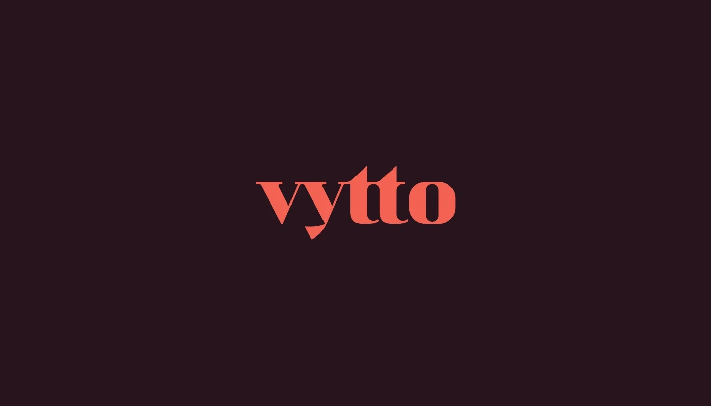
Three capsule forms are subtly integrated into the negative space of the t, t, and o, creating a hidden connection between the name and its three products. At the same time, the three capsules represent the three founding members, giving the mark a second layer of meaning. Three people coming together around one shared vision for women's wellness. The same capsule symbol carries through to the bottle caps, turning the identity into a physical product signature that becomes recognizable even before the label is read.
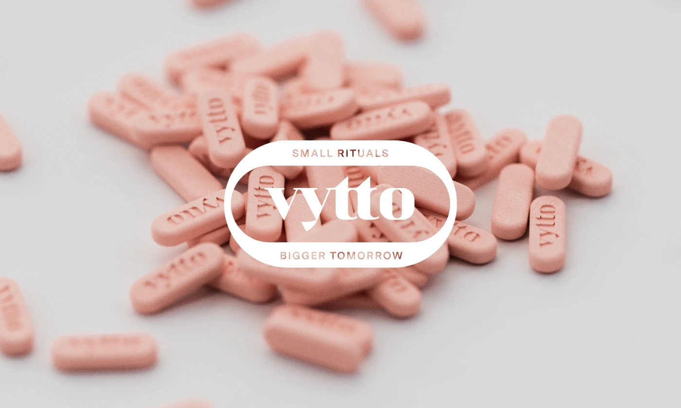
The colour system moves away from the sterile whites and predictable greens often associated with supplements, drawing instead from earthy tones and natural elements. Rich and dark burgundy establish a grounded foundation, while Coral introduces warmth and energy. Soft pink, green, sky blue, brown, and warm off-whites create a broader palette that allows each product to have its own emotional territory while still belonging to the same family.

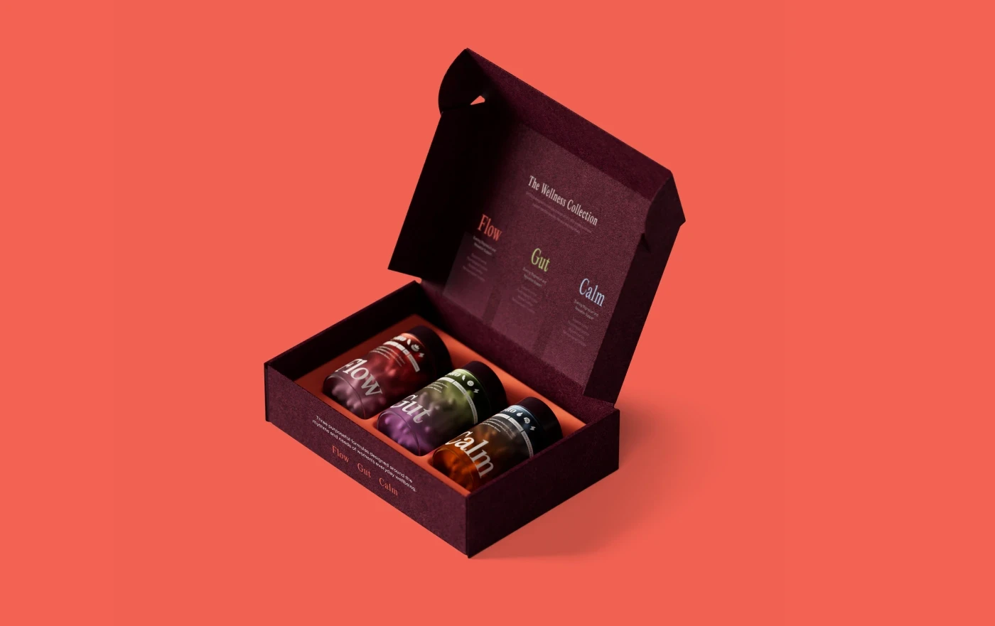
The bottles use tinted, frosted gradient glass, creating a tactile and atmospheric quality that makes the products feel more like considered objects than conventional supplements. Light moves through the gradient surfaces, giving each bottle depth while reinforcing the natural, fluid character of the brand. The three-capsule detail on the cap creates a small but memorable interaction, transforming the packaging into a physical manifestation of the logo. Large, editorial product names give the range a confident presence, while restrained informational typography keeps the communication clear and approachable.

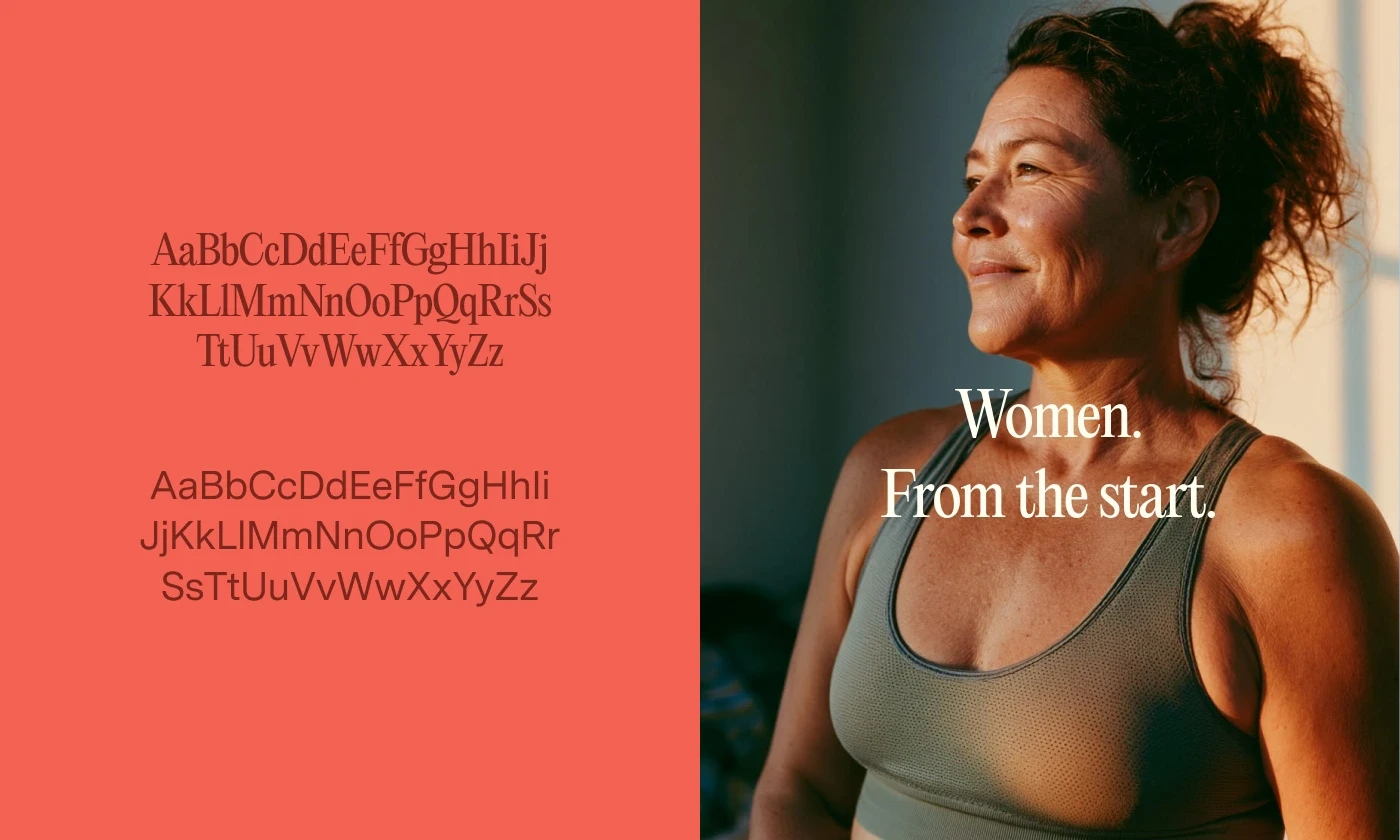
Instead of depicting wellness as an idealized lifestyle, the imagery focuses on everyday rituals. Product photography uses dramatic yet warm lighting to reveal the translucent bottles and rich colours, while lifestyle imagery introduces a sense of lived experience and emotional connection.
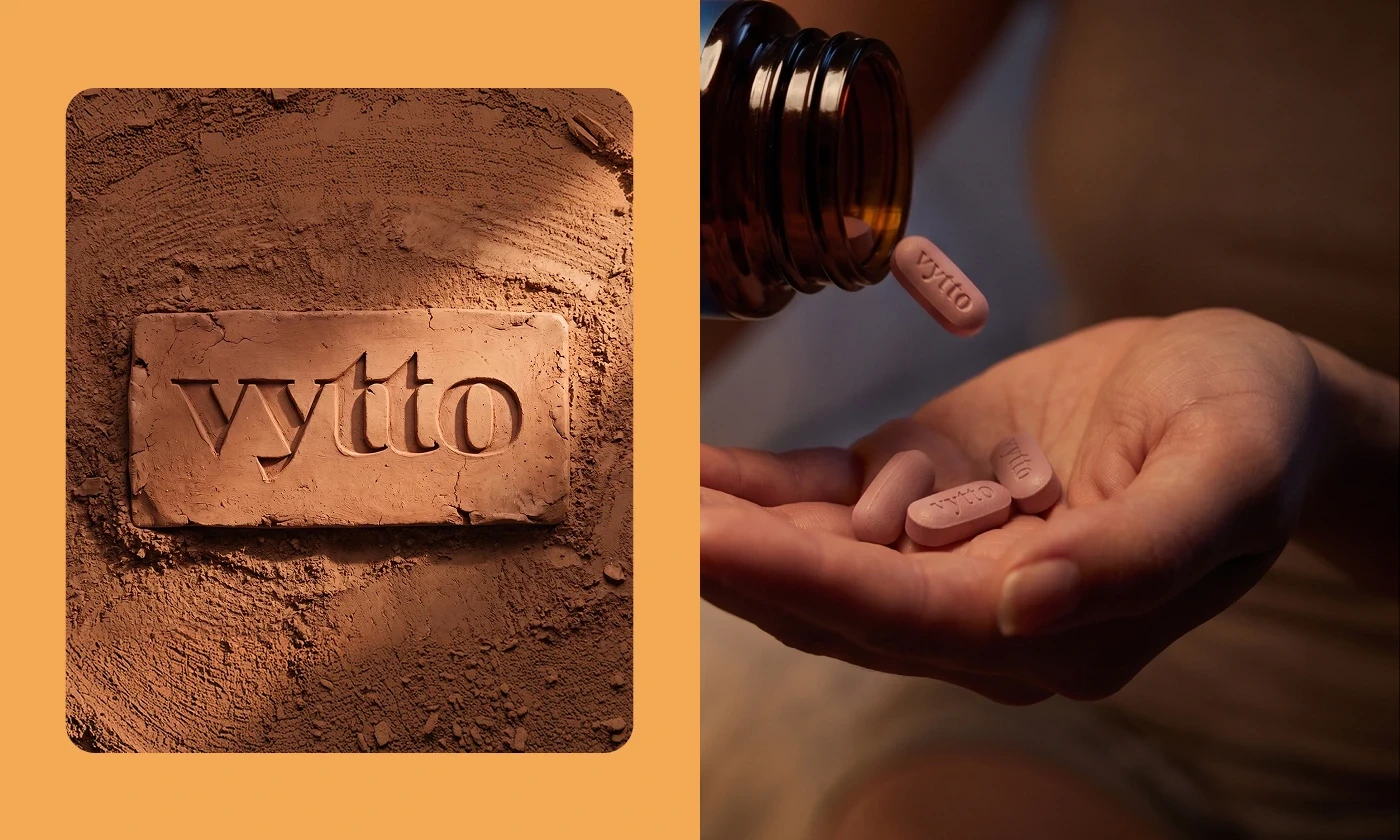
The website brings these elements together through an editorial layout that balances serif-led expressive typography with clean, functional information design. Product benefits are communicated without overwhelming the user, while the broader brand experience encourages women to explore wellness through rituals rather than rigid routines.

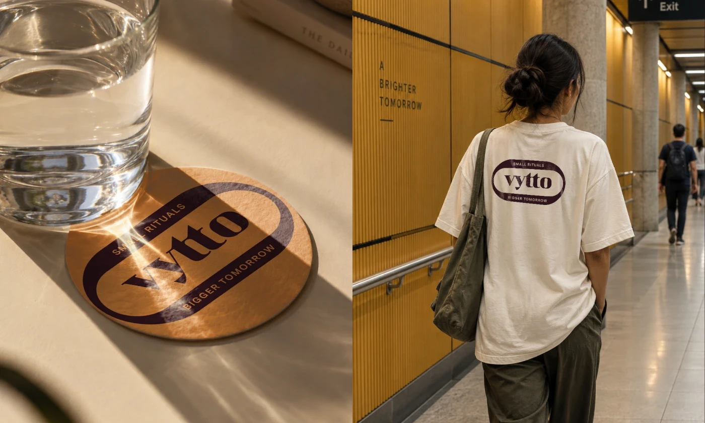
A close collaboration with the founding team resulted in a more differentiated presence in the crowded wellness category, with distinctive tinted-gradient packaging, a memorable capsule-led identity, and a warmer, more human visual language designed to build recognition, trust, and connection with women.
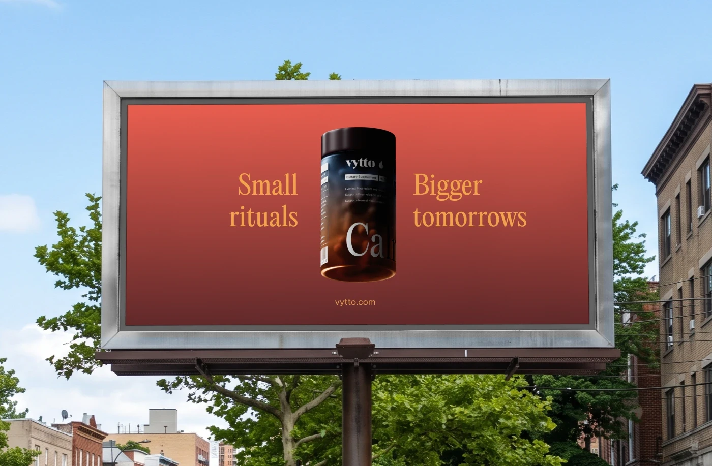
Strongest impressions are often made not by adding more, but by leaving only what truly matters.