Mouthment
Oral Care
Wellness
Consumer Goods (CPG)
Mouthment emerged in the Netherlands with a simple belief that oral care should feel as refined as the ritual itself. Inspired by the natural purifying qualities of charcoal, the brand set out to challenge an industry crowded with loud promises, clinical aesthetics, and shelves overflowing with indistinguishable products.
Brand strategy / Brand identity / Logo design / Packaging design / Visual identity / Art direction
The custom logo distilled the silhouette of a tooth into a single continuous gesture, creating a mark that feels unmistakably human while remaining iconic at every scale.


Bold typography introduced confidence without unnecessary decoration, allowing the products to command attention through proportion rather than excess. A disciplined monochrome palette elevated charcoal from an ingredient to the defining visual language, turning contrast itself into a recognizable brand asset.
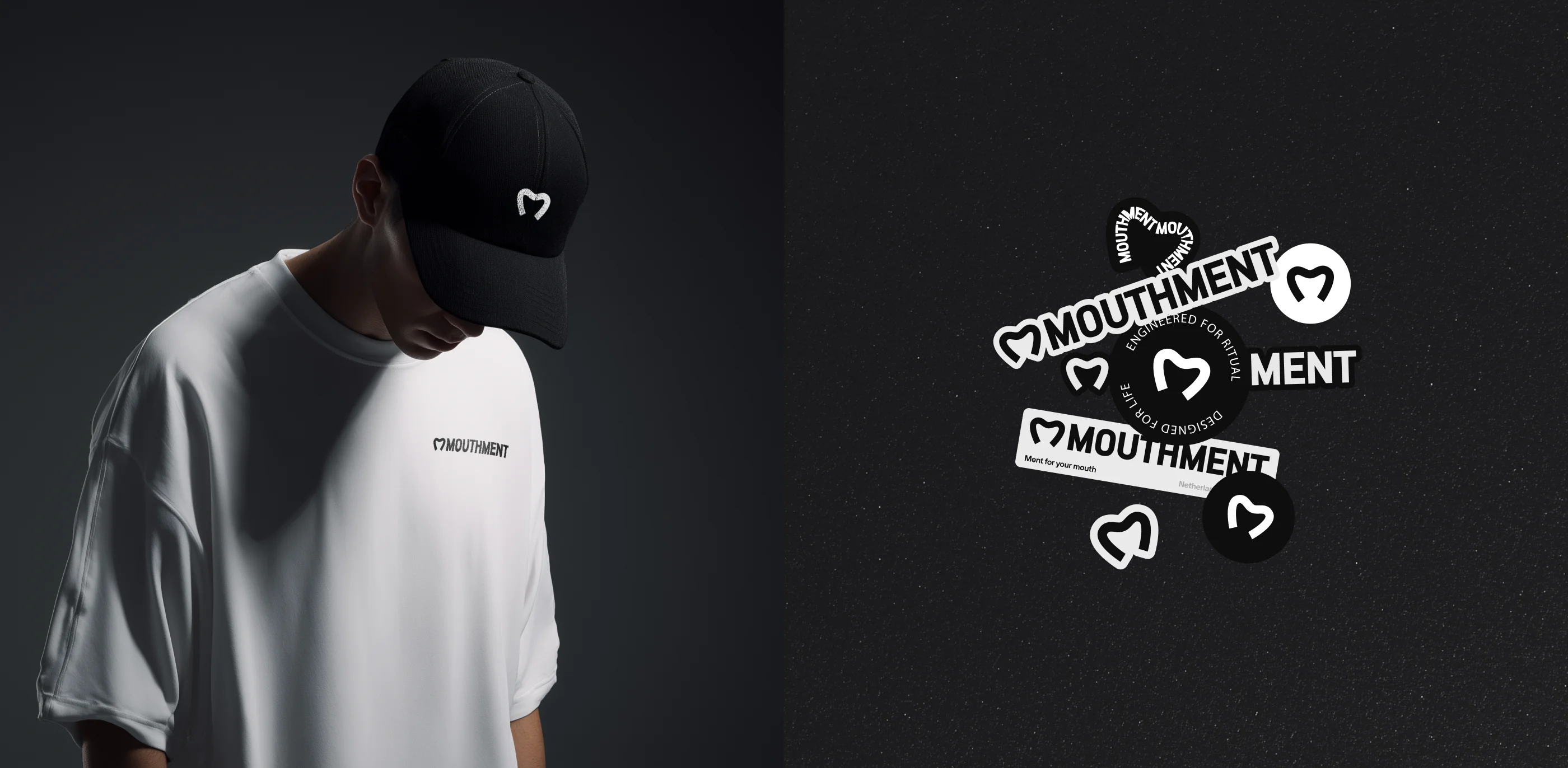
Product photography favored sculptural light, rich shadows, and tactile textures to celebrate materiality, while subtle motion echoed the calming rhythm of everyday rituals instead of exaggerated transformation.
The result was a cohesive identity that cut through visual noise with remarkable clarity, transforming Mouthment from another oral hygiene startup into a distinctive premium brand whose quiet confidence became its greatest competitive advantage

The shortest distance between talent and opportunity.