Bridge
Recruitment
HR Tech
Services
Bridge was founded in the Netherlands with the belief that recruitment is less about filling vacancies and more about creating meaningful connections between people, businesses, and opportunity.
Delivered brand strategy, brand identity, logo design, visual identity, illustration system, and marketing collateral.
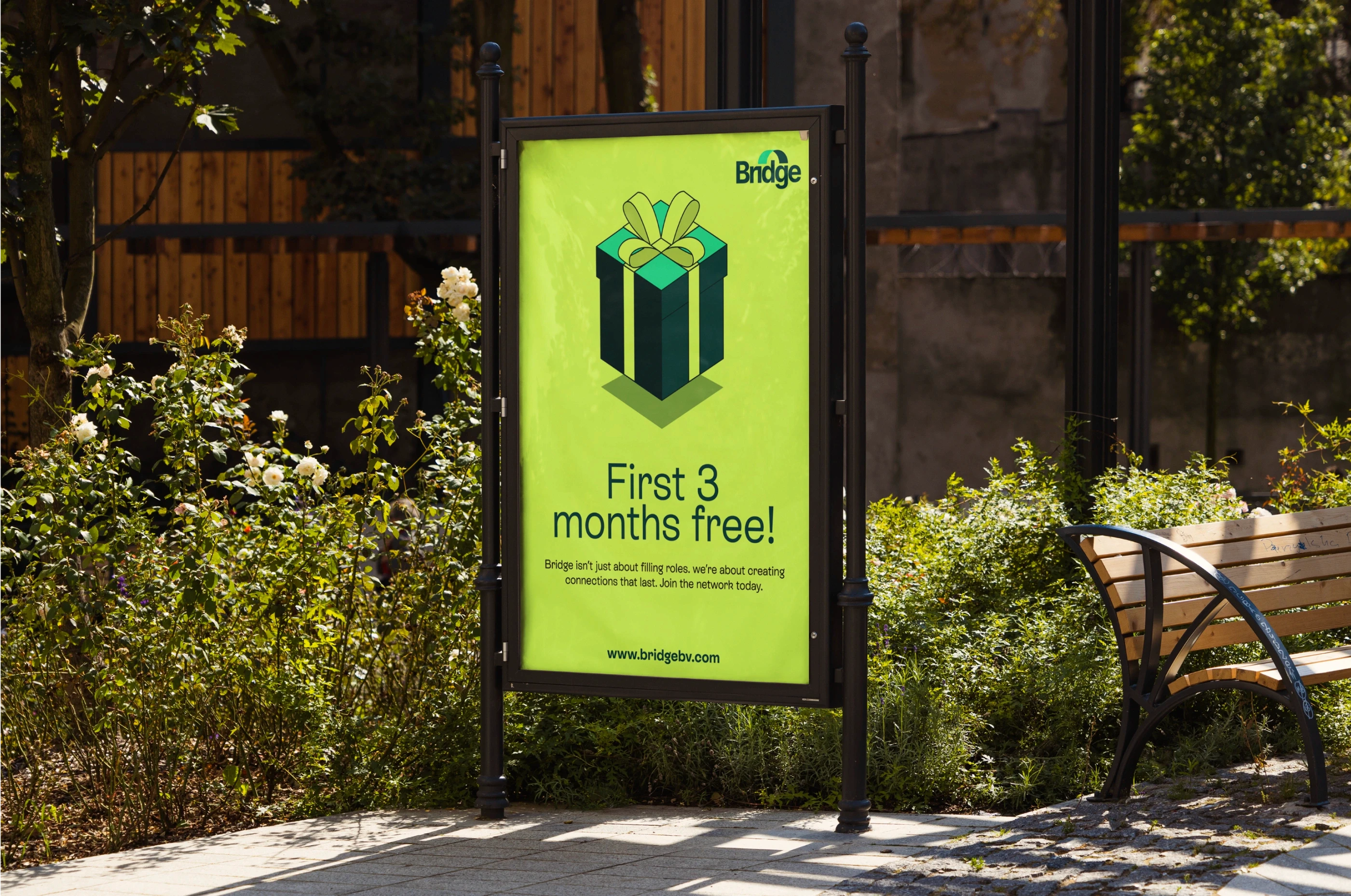
The custom logomark subtly forms an architectural bridge within the letterform, symbolizing connection without relying on literal symbolism, while its rounded geometry reinforces approachability over corporate distance.
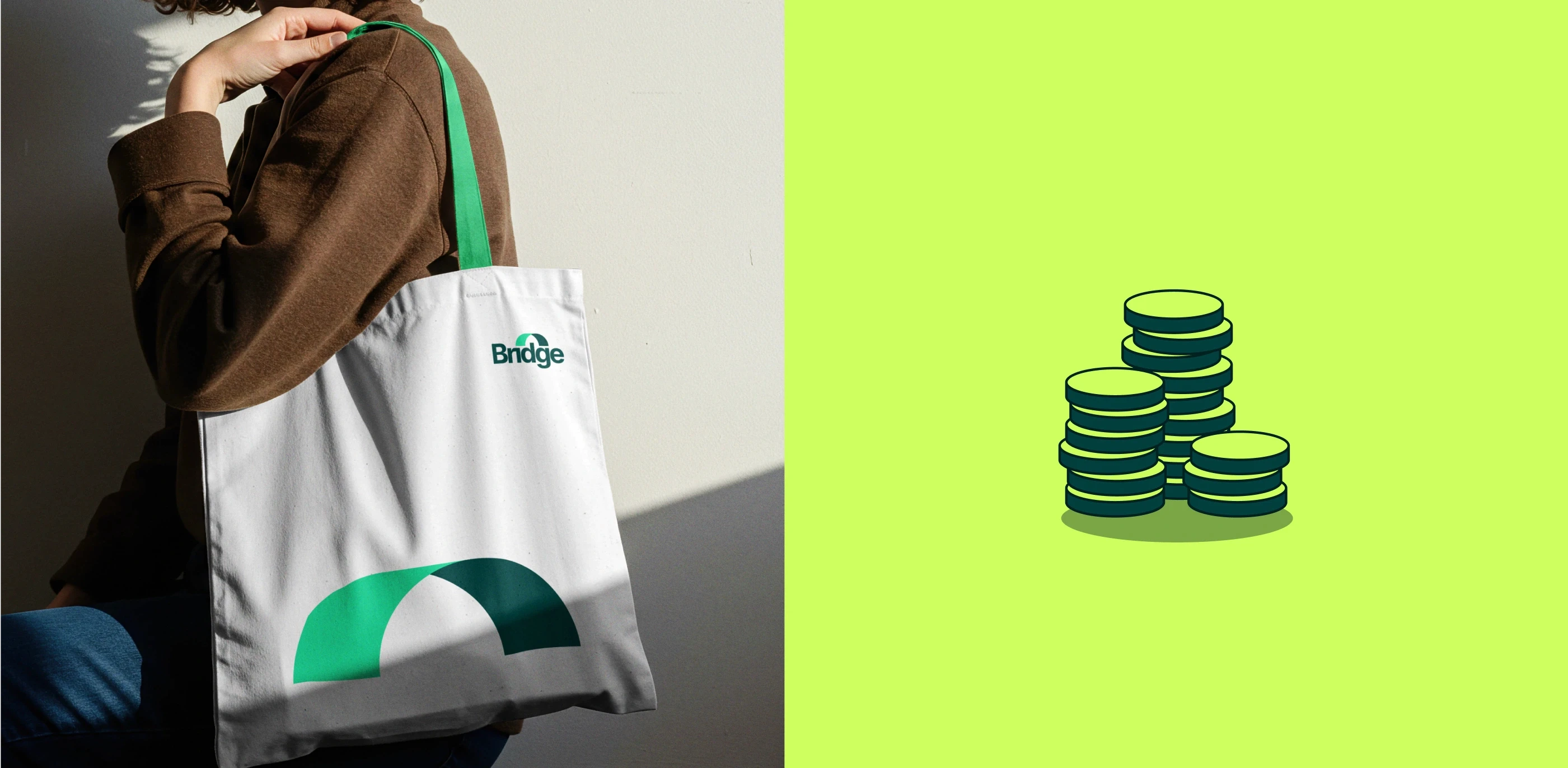
A bold emerald palette introduced optimism and confidence into a sector dominated by predictable blues, creating immediate distinction while signaling growth, momentum, and long-term value.


Isometric illustrations turned abstract recruitment metrics into playful, dimensional narratives, making conversations around careers, hiring, and business growth feel accessible rather than intimidating.
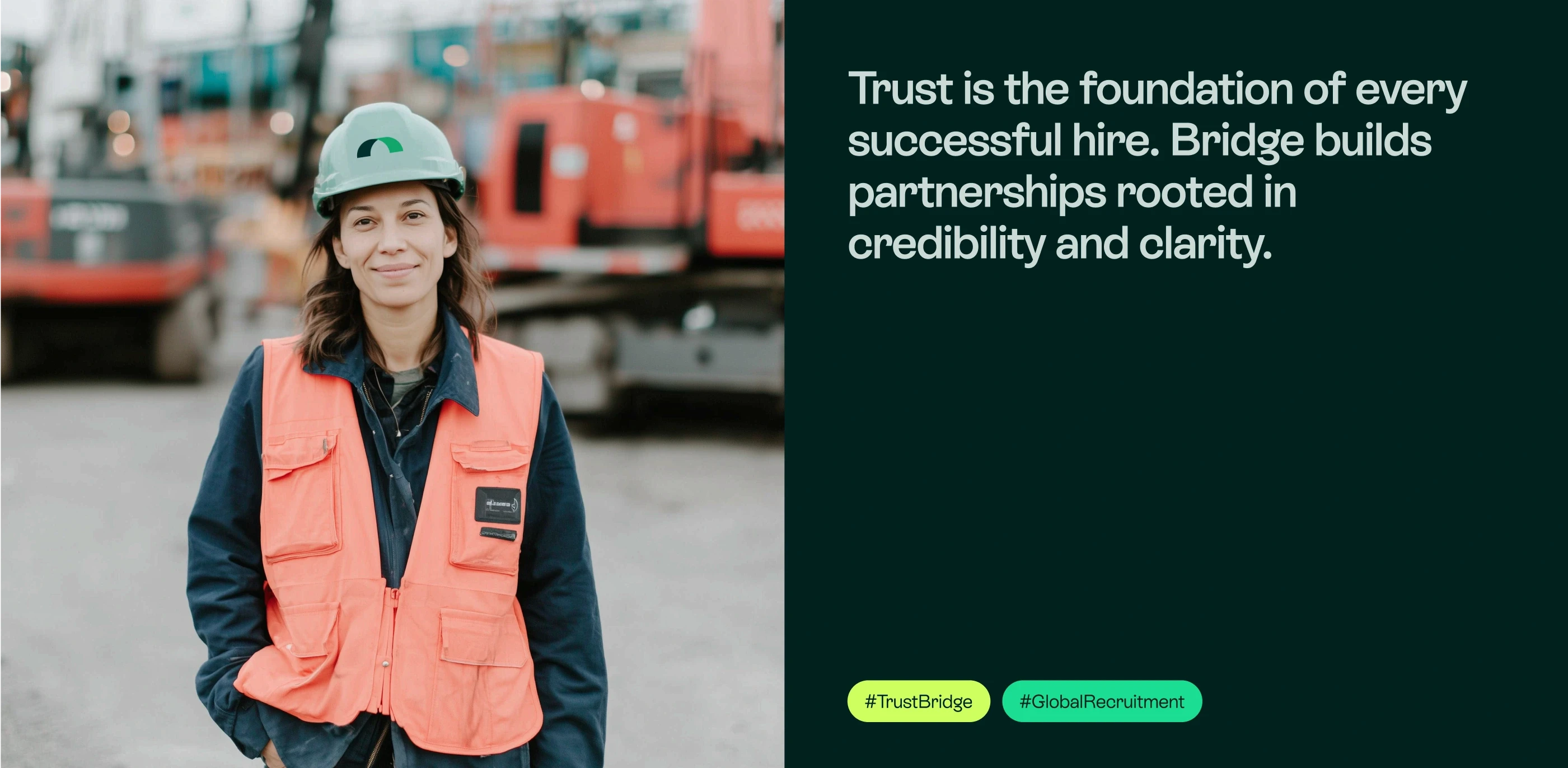
Typography balanced clarity with warmth, allowing every interaction to feel structured yet unmistakably human, while concise, conversational language replaced recruitment jargon with confidence rooted in honesty. Every element of the system worked together.

Bridge stood apart not through louder messaging but through unmistakable character, helping establish a memorable presence in a saturated market while strengthening trust with both employers and candidates.

Rebrand that quietly empower everyone connected to them.