NetNation
B2B SaaS
Cloud Infrastructure
IT Services
NetNation has spent years helping managed service providers, telecommunications companies, and technology partners deliver enterprise-grade infrastructure through white-labeled solutions that quietly power thousands of businesses behind the scenes.
Delivered brand strategy, rebranding, brand identity, website design, UI/UX design, and 3D illustration.
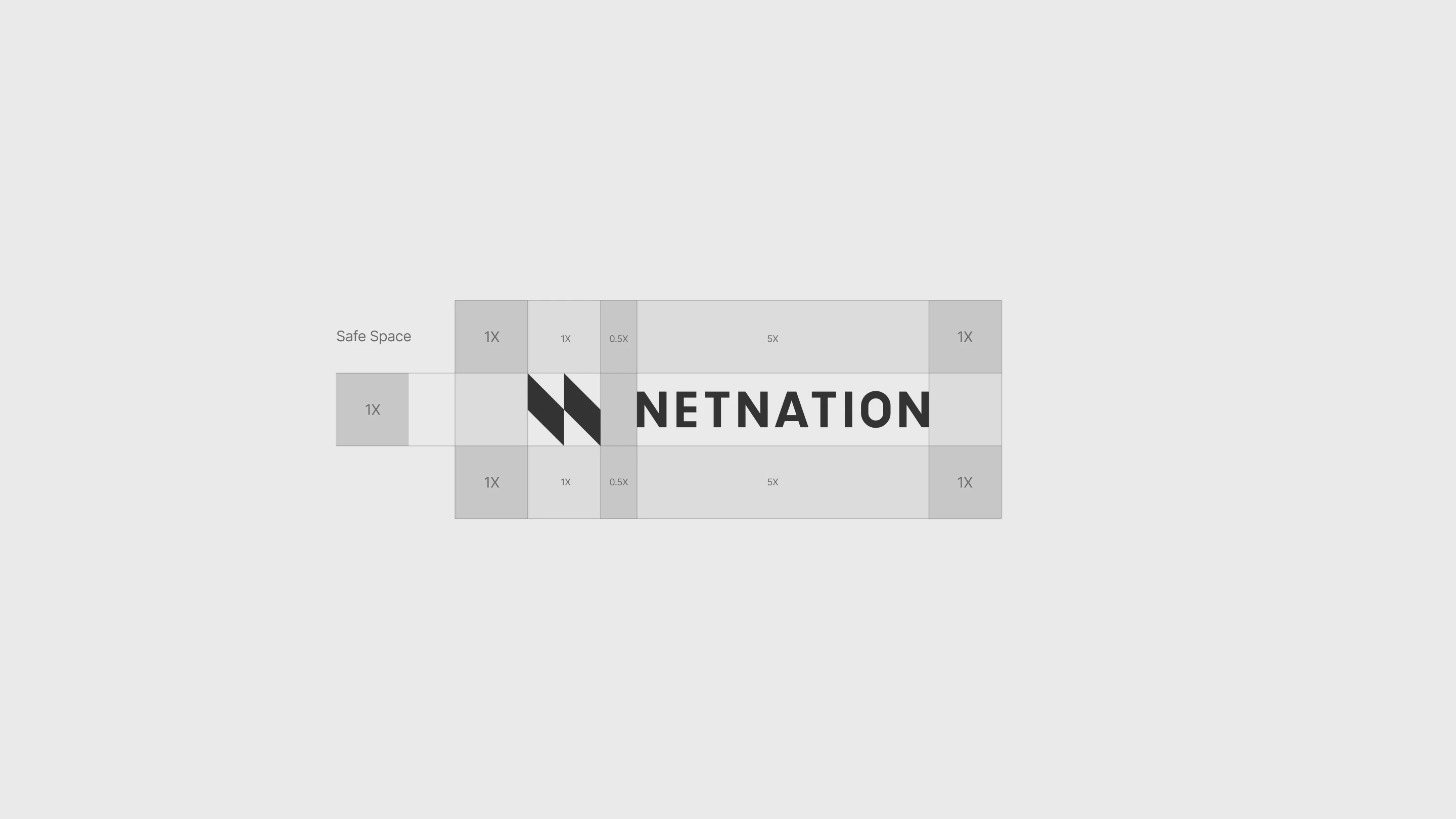
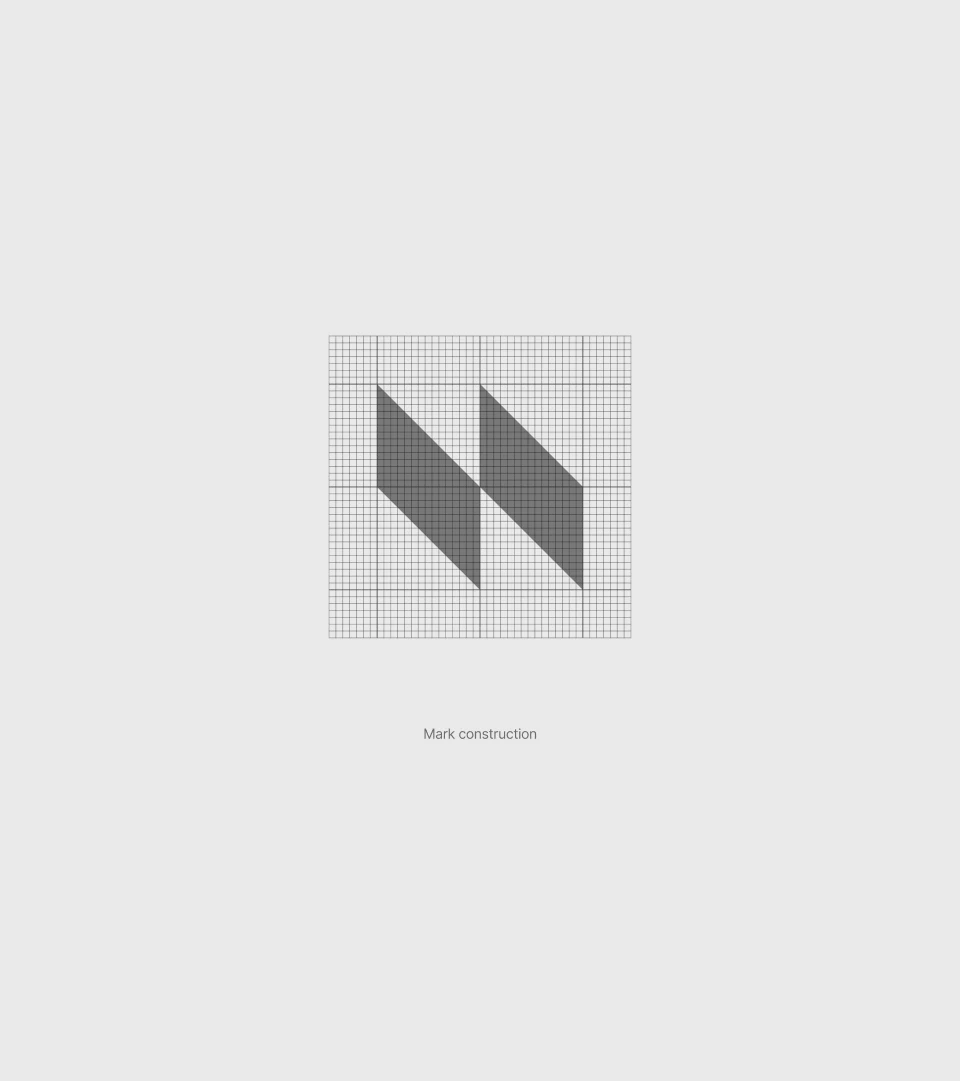
The geometric "N" mark was constructed from two forward-moving forms that suggest connection, expansion, and continuous data flow, expressing a network in motion rather than a static symbol.


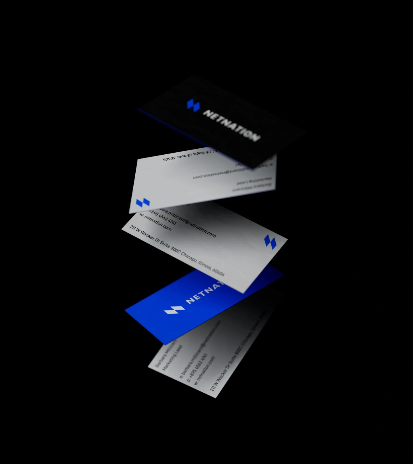
A bold electric blue introduced energy and optimism into a category often dominated by conservative enterprise aesthetics, while generous whitespace created clarity in a world typically overwhelmed by technical complexity.


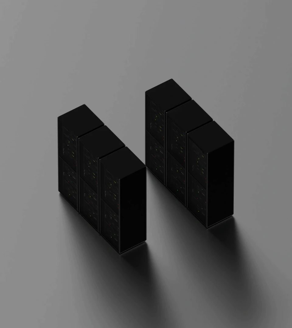
Three-dimensional visual language transformed abstract infrastructure into tangible architectural forms, servers became sculptural objects, networks became living systems, and the globe evolved into a symbol of seamless connectivity rather than geographical reach.





Together, these elements created a cohesive system that communicated confidence without noise, positioning NetNation as the trusted foundation beneath every successful digital business.


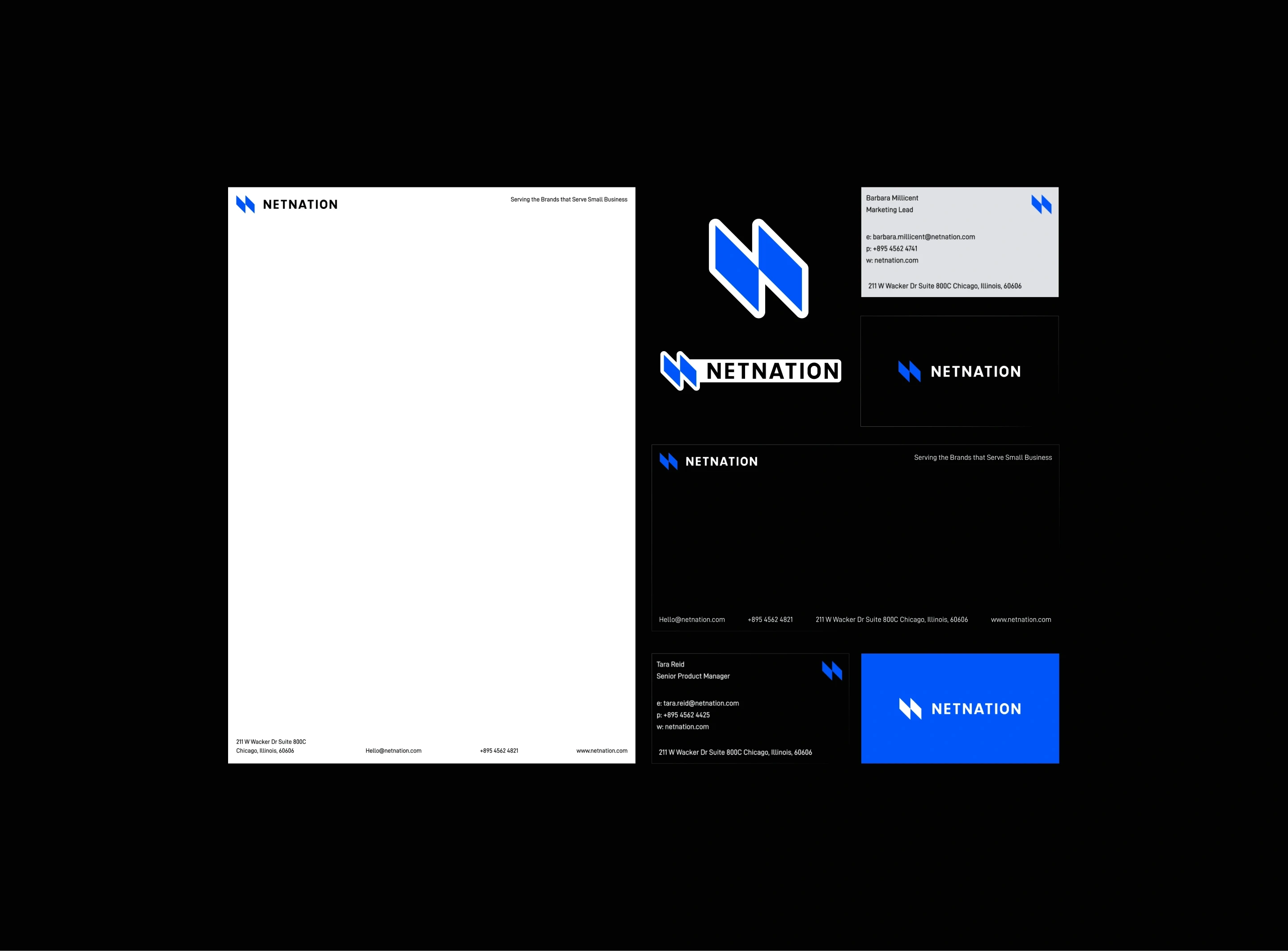
The rebrand elevated perception from infrastructure vendor to strategic growth partner, giving customers a brand they could confidently stand behind while reinforcing a simple but powerful idea: the strongest networks are the ones that quietly empower everyone connected to them.

Raising the bar was never about standing above everyone else, only about becoming impossible to ignore.