Cento
B2B SaaS
Cloud Infrastructure
IT Services
Cento was created from scratch as a restaurant inventory management system. when every ingredient, order, margin, and movement is connected, restaurants can operate with far greater clarity and control.
Delivered brand strategy, brand identity, website design, illustrations and motion.
The logo mark translates this idea into a simple circular form inspired by a pie chart, suggesting both the composition of inventory and a complete 360-degree view of what is happening inside the business.
A bold yellow became the brand’s signal of energy, visibility, and decisiveness, balanced by warm neutrals and black to create an environment that feels precise without becoming clinical.


Montserrat gives the identity a strong, contemporary voice for headlines and key moments, while Inter brings clarity and accessibility to the dense information environments where the product lives.
Editorial-style illustrations introduce a more human perspective, depicting chefs, ingredients, tools, and restaurant life with loose, expressive lines, while photography grounds the system in the people and places behind the numbers.
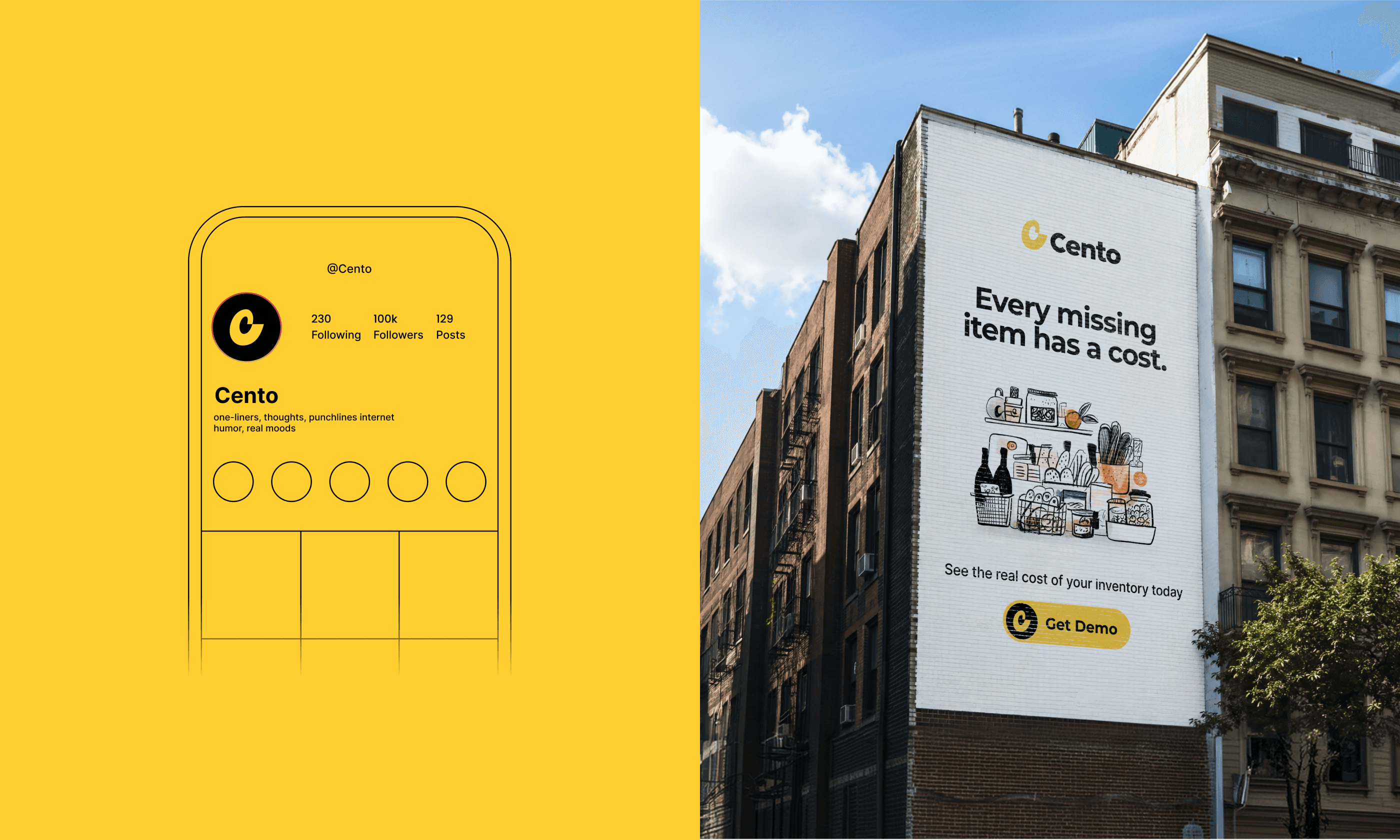

Together, these elements created a visual language that turns operational complexity into something approachable, intelligent, and distinctly human.

As a result, Cento emerged not simply as an inventory tool, but as a brand that gives restaurant teams a clearer view of the business they work so hard to build.

Branding for full-service digital marketing agency built to help brands navigate the increasingly complex demands of B2B growth